Some reports display in a chart view. Each chart view report looks a little different, but they all contain similar information, navigation, and customization techniques. Most chart-type reports include:
•Line reports: Used primarily in Survey and Trend charts
•Column (vertical bars) reports: Used primarily in trend or the Maintenance Analytics
•Bubble reports: Used primarily in the Impacts Survey Impacts. This allows three dimensions of information to be plotted. For example, deadman hours (x-axis), number of recorded impacts (y-axis), and number of vehicles (diameter of bubble).
•Plot Chart reports: Used primarily in Energy Survey Detail
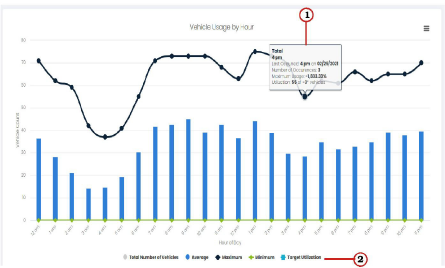
An example chart view report appears below. Each component in the example is numbered. A description of each component and how to navigate within the report is described after the example:
The numbers in the list below correspond to the image above:
|
Modules with chart-type information contain tool tips (hover text) which appears when you place your cursor over the bars or points in the chart. |
|
|
Select the item in the legend that you want to display or hide on the chart. The text in the legend is grayed when it is hidden. Multiple items can be selected. The lines on the graph are different colors and have different shapes. The many variations accommodate companies with a large number of facilities. Each color and shape represents different information. For example, the blue and black lines in the example above represent the following: •(blue) = The usage trend of the selected vehicles within the date range. •(black with diamonds) = Total amount of time the selected vehicles were used within the date range. |
Related Links